
April 23, 2013. Images from Anne.
Thanks for submitting 5 images Anne. The first two I will show are just as you submitted them. For the next three images I have taken the liberty to make some changes to the images to point out a couple of things that might help everyone with their image making. I hope you don’t mind.

Rock Symbols

Rock

Hay bales I

Hay bales II
As you can see, I cropped out some of the bright sky and eliminated the twigs. I also darkened the sky a bit and brought out more detail in the shadows. I couldn’t resist doing a slight bit of dodging and burning to bring out a little contrast. Personally, I now really enjoy this image and I totally understand what drew you to it. I love those hay bales!

High Level Road I
I know this spot so well and have made many images here, but this is a fresh perspective which I am really enjoying. I had two thoughts when I looked at it. I found the tiny bits of sky bothered me and the image looked rather flat. So once again, I took the liberty of showing you a different version.

High Level Road II

Optical Illusion I
This is a fantastic ‘pick off”. What a great subject. There was just one thing that bothered me and that was the second bright spot right below the main centre of interest. Then, the more I looked at the image, the more the large black area in the lower right drew my attention away from the fascinating area you so aptly called “optical illusion”. So once again I started to see if I could make some improvements.

Optical Illusion II
This is what I did. Firstly, I cropped the base. Now I feel the shadow in the lower right and the small dark spot in the lower left are extremely important elements in this composition. They give balance and solidity to the image. That’s probably because these two dark areas together with the bright hole in the centre form an implied triangle! Then I did three things: I gave a very slight saturation boost to the red rock and the yellow centre. Finally I revealed a little more detail in the shadows of those fabulous rocks just left of the centre hole. (hope you didn’t mind me doing this!)Now I feel you have an amazing image. I could look at this image for a long long time and get more and more out of it. I could also talk about this image for ever from a compositional perspective. There is a lot going on here.
Anne, I think you have a wonderful eye. Next, I would try and put a little more effort into the processing part of your image making. It will go a long way to helping you say what it was you were trying to say when you made the image in the first place. I did very little to this image. Four or five quick adjustments that took 2-3 minutes. I feel it made a big difference…I hope you agree!!! Congratulations! WOW!!!
April 23, 2013. Images from Bob.
Bob submitted four landscapes and two people shots which I will show at the end to say farewell to this part of the workshop. Here we go!

untitled
I find this a powerful composition, mainly because of the tonal contrast between the foreground rock in shadow and the brighter background landscape, as well as the vast number of lines which go in contrasting directions creating tension. Look at the sloping lines in the background compared to the darker lines of the foreground rock & cliffs. Fantastic photograph.

I love this image Bob. Two powerful triangles with beautiful contrast in colour. A great ‘pick-off’ and great composition!

untitled
Once again, two giant triangles of land with rectangular shapes of sky and water above and below. I think this is a very pleasing composition. Better light could have made this spectacular!

untitled I

So, I changed the colour balance and I also did a little dodge and burning to bring out the three-dimensionality of the rocks. Now I see a more believable landscape with a very pleasant composition. I really enjoy this. (By the way, the two images above are smaller than the first two because you sent them smaller)
Well, I am going to end this section with two people images that Bob sent.

Elodie

me!
Me saying goodby just before falling backward into the Fraser River…never to be seen again!!!
Well, thanks everyone for being such good sports and submitting your images. I really enjoyed the entire trip and I have really enjoyed doing this little extra critique session online. I learn so much by critiquing. Usually it’s critiquing my own images for my Newsletters but I have so enjoyed doing this with your images. Hopefully we all got something out of it.
Thanks EVERYONE! It was a BLAST! Yahoooo!
December 14, 2012. Images from Larry.
Larry submitted six images which show a very keen eye for turning what many would consider an ordinary vista into a
beautiful landscape image. Larry’s images also exhibit his expertise at processing raw files. Let’s take a look at Larry’s
submission, starting with three landscapes.

“Russian Island”
To me this was a very ordinary vista, but with a beautiful cloud formation, and the position of the sand bar
leading up toward the cabin, Larry has made this into a very pleasing image.

“Lone Tree”
Two triangles sized beautifully, and the well chosen placement of the tree, makes for a wonderful grass/canyon landscape.

“Dry Water Course”
This is a scene one could easily take for granted and not be bothered to make a photograph of. But Larry
saw its potential and composed it beautifully. It has a nice sense of balance.

“Dry Creek Bed”
Now we are getting more abstract. Great observation. Simple yet powerful. Two triangles and a diagonal line.
That line could have been horizontal or any other direction but Larry chose to display it as the most powerful
line of all…the dynamic diagonal line. The equal size of the two triangles and the equal width of the diagonal line on the lower
right vertical axis and upper left vertical axis is perfect. Well done.

“reflection”
Although I asked for only five images each, (I am trying to be fair and equal!) I am putting Larry’s sixth image in
because I admire his confidence and courage at submitting this image. I feel many would not submit this
image, in fact, I feel many would not even bother to process it. Some might even delete it. I love the sense
of wonderment here. It asks more questions than it answers. Beautiful.

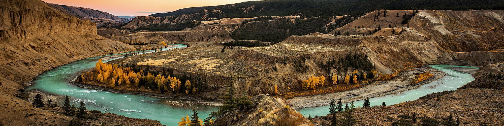
“The Mighty Fraser”
A wonderful composition and extremely well processed. It really shows how that rock pushes the level of
the river up in front of it. I also love the colour contrast between the red rock and the green vegetation with
its reflection. I feel the colour green is the most difficult colour to get right when processing. I always want
to over saturate it. In the above case I feel it is a little over done…but…hey…it’s subjective. And maybe from
where Larry was standing way up on the cliff, it was like that (this is one reason why I don’t like critiquing!).
I have images of a pure blue Fraser River when we all know it’s brown. It was the reflection off the blue sky.
So apart of the whole colour debate, I feel this is a beautiful and very strong composition.
Thanks Larry.
And see you tomorrow morning for coffee. I’m giving you Kudos here in the hope you pick up the tab tomorrow!!!
December 14, 2012. Images from Elodie.
Here are 5 beautiful images from Elodie. These really show the diversity of subject matter we were exposed to over a very short 5-day period. In these images Elodie shows a keen eye for composition, along with a command for HDR image making. Let’s take a look!

This is a beauty. I love the composition. Not too many people would place that pole in the centre but it is so beautifully balanced with the box and window on the left and the single but stronger yellow jacket on the right. This has to be an HDR due to the extreme tonal range in that cabin. Really great image!

You have to love this old guy! Well captured. Eye in focus, yet motion in the wings.

A great example of recognizing tonal contrast. Great shapes and I love the small but equal size you gave to the very top and very bottoms triangles.

Still life with excellent balance. Good choice of aperture as well for shallow depth of field.

Not sure what it is but I love this image. It has to do with the balance between the mountain and the two shapes below it. Perfect! Also the width given to the water and the sky above the mountain peak being equal. All those elements add up to a strong landscape photograph.
Well done Elodie and thanks for sharing!
December 14, 2012. Images from Dennis.
Today I am posting some images submitted by Dennis. Dennis has sent me a
lot of images, so I have taken the liberty to pick some myself and
share them with you.
Firstly, I want to thank Dennis for the
DVD that arrived in the post last night. I immediately took a look at it
and it certainly brought back a lot of great memories and good belly
laughs! Dennis, you seemed to approach this trip like a dog following a
good scent! You explored everywhere and found an amazing variety of
subject matter, just as if you were on assignment. Your DVD was the
result of that spirit and I for one certainly appreciate the effort you
put into making it. The odd technical flaw never bothered me one bit. I
just enjoyed your spirit which showed through it. In celebration of that
DVD I am starting off with 6 of your people pictures which caught some
of that spirit which you shared with us all.

Thinking creatively!

The stance of a pro!

A happy camper!

Enjoying the journey!

Yelling at Doug to catch a fish!

Film director takes a break!
Ok…here are 5 images from Dennis. (Dennis, you seem to think that I was going to critique everyone’s images. I don’t think I ever said that. I would prefer not to; I’ll just make general comments. I just want everyone to enjoy seeing some of the other images made on the trip. Let’s just enjoy our imagery.) If you wish, I can discuss an image with you on the phone.
1.

I really like this Dennis. The foreground gives the ‘Cathedrals’ a sense of scale. The sliver of sky is great.
2.

I love the b&w and the placement of the road. There is a sense of mystery here.
3.

I know you felt the spirit of these rocks and the hole in the rock. I like the two triangles!
4.

Now you are moving in which is good. Including the river for context means there are two subjects of interest. Not sure if that is what you wanted. (BTW, these rocks with their sheen are very challenging to capture. It might have been a good opportunity to shoot as HDR images)
5.

Now you have really moved in and to me this really speaks of the spirit you felt. I like the perspective here. A little more attention to compositional detail may have helped. You came close to making a real winner here. I love this.
Thanks Dennis for sharing. And thanks again for making that DVD.
Next I will share some of Elodie’s images.
December 13, 2012
to be back home again. It’s never easy being on the road but Rita and I have really enjoyed re-uniting with so my old friends around the province as well as meeting new photo enthusiasts. The fact that Flyover has been a HUGE success and best seller has also helped!!
So here is my last posting of images. I will be posting yours over the next few days before Christmas.
Fittingly these four images were made on the last day of our trip. The first three were made using my 8-stop vari-neutral density filter – the only filter I carry. This enabled me to use a slow shutter speed to soften the water and create a more tranquil mood.

7:43 am. iso 100; f-22; 15 sec’s; lens at 67mm.
This was made before the morning sun hit the distant red cliff. I like this image because the foreground rocks give context, but more importantly from a compositional perspective, it is the implied triangle that gives stability to this image. The two dark rocks and the red one in the river form the implied triangle. Even the rock foreground in the bottom right is a triangular shape of about the same size. My final test is to examine how my eyes travel through the picture space. For me, my eye never feels like leaving the space and it moves around freely without getting stuck in any one place. The whole image provides balance and interest.

7:47 am. iso 100; f-22; 20 sec’s; lens at 35mm.
Four minutes later, the sun is starting to reflect off the upper part of the red cliff onto the river. I have raced over to the other side of camp to utilize this contrast in colour. In this composition I utilize three diagonal lines (and their resulting shapes). The first is the rock shoreline in the lower left. The second is the line between the lighter blue water and the darker green/brown water (accentuated by the pink colour). The third line is the shoreline in the upper right. These three lines, due to their similar angle, draw my eyes from lower left to upper right. They would have a tendency to go right out of the image in the upper right if it were not for the big red river rock in the upper left. That rock draws my eyes back into the picture space. This is what rescues the image for me.

7:58 am. iso 100; f-22; 10 sec’s; lens at 100mm.
The difference between this image and the one above is a good example of compositional change by utilizing different focal lengths. Wide angle lenses expand distance and thus require prominent foregrounds for stronger compositions. By compressing distance with a longer lens (above), I have completely changed the emphasis of the purpose or message.
So, as you can see, that 15 minute shoot was both exciting and intense. I remember it well. Coffee with bacon and eggs could never have enticed me away from this. The key here was to recognize the magic that was happening and drop everything and go for it. Great light does not last long.
Ok…one last image to end this extended Fraser River workshop.

11:36 am. iso 800; f-11; 1/4000 sec; lens at 24mm.
Just before the trip ended, I made this image with the rainbow. A fitting farewell to a fabulous adventure.
November 13, 2012
I am off early tomorrow am so am throwing in four images before I leave.
Two night time images and two sunrise images. I don’t consider them anything special, but they are the kind of shots I like to make because they fit well into slide shows or story lines. So if I was going to submit a portfolio to a magazine as part of an assignment, I would include these because they often get used. When I make slide shows to music I usually have day long sequences, so these are great for starting and ending such a sequence.


Both the above were shot wide open on ‘bulb’ at iso 200. Can’t remember the length of exposure but less than an hour to conserve battery power.

iso 200; f-10; 10 secs;

iso 200; f-16; 1.3 secs.
Ok, I’ll just do two more posts at the end of the month. How about sending me some of your images so we can share how differently we all see things. Three to five would be great. Please size them at 600px at 72dpi. Saves as jpgs at Quality-6 is good. If you would like to make comments, that is fine. It’s just for interest and fun.
Thanks everyone. Cheers for now.
November 7, 2012
Back again! I’ll be leaving for extended periods of time soon so am I’m trying to post almost daily.
Look for areas of Contrast: Very early on the trip I spoke about looking for areas of high contrast. Wherever there is contrast, there is potential for great image making. It’s the very first thing I look for when in the field. Once you get used to looking for contrast, you will see images everywhere.
There is tonal contrast and colour contrast. Lets look at the 5 images below as examples.

iso 800; f-10; 1/500 sec.; 100-400mm lens; handheld
I wasn’t the first person to see this subject, or to photograph it, at our first campsite, but the mainly high tonal contrast between white and black makes it a perfect subject to photograph. I positioned myself so that the background was in deep shadow, under exposed so as to further darken the background, added a little more contrast in the processing, and voila…a very simple natural history image.

iso 400; f-8; 1/800 sec.; 100-400 mm lens; Handheld
Here we have both tonal and colour contrast. I noticed it while passing in the boat. The shape really stands out due to the contrast.

iso 400; f-10; 1/320 sec.; 24-105mm lens; Handheld
Similar to the above image except the contrasts are reversed; dark against light vs. light against dark. Either way, it excentuates the shapes within the image, and shapes are one of the major elements of composition.

iso 800; f-8; 1/800 sec.; 100-400mm lens; Handheld
This is another example where contrast brings out the shapes within the landscape. As I am primarily a landscape photographer, shapes and therefore contrast, are very important to me. You will also note that I am using faster shutter speeds with my longer lens to overcome camera &/or hand shake.

iso 800; f-9; 1/500 sec.; 100-400mm lens; handheld
There is both colour and tonal contrast here. I remember very specifically making this image. Contrast grabed my attention first, but immediately after that I had to concentrate on composition. There were the shadowed shapes in the foreground creating contrast, and there was the vertical black line in the background providing great tonal contrast within the huge rock wall. The placement of the vertical black line was critical in this composition. I would have preferred if it was a tad more to the left but I am certainly ok with it as it is!
So there we have it…more food for thought when we are out making imagery. Always look for all forms of contrast!
Cheers,
Chris
November 6, 2012
Back from Prince George where we had a very successful time at Studio Fair. The book is selling really well…great news!!
Experiment: At our last campsite I tried shooting directly into the sun, aiming at the reflections in the river. There was no colour at all. I only added contrast in the precessing. Just thought I would share the results with you.

iso 100; f-22; 3.2 secs. handheld

iso 100; f-22; 2 secs.; handheld, moving in small circles
In the second one I tried to be a painter and just pretended to be making paint strokes by moving my camera.
Having tried this, I now have new ideas about what I would like to try next time.
The creative process never ends. Try anything, it’s free. Try and push yourself visually. Chances are you will get new ideas to try next time you are out in the field.
Cheers…
October 30, 2012
I’m back again! I thought I would do one more posting before I leave for Prince George.
Abstracts: This time I am going to share some of the abstracts I made along the shoreline at our camp just below Churn Creek. Remember I asked you to just totally jump out of the box and be wild! Try anything, any movement with the camera at various shutter speeds. The great thing about digital is that you can look at the results and get a good idea of how close you are to getting something you like. Then fine tune your settings and try again. Keep trying until you get something you like.
Some times you feel a little awkward or crazy doing something like this, especially with others around looking at you. Hey…just go for it!
Here are four images which I enjoy.

On a tripod to get the letter’s sharp.

f-14; 1/15 sec.
Hand held with a panning action.

f-22; 1/13 sec.
Hand held with a panning action.

f-22; 1.6 sec’s.
On a tripod. The slow shutter speed softened the wave action but not the beach.
So there you go. Everything is worth a try! That’s it for now…until the next time.
Cheers for now.
October 29, 2012
Hi again!
Back from our Vancouver trip which was a great success. Here are a few
more images and thoughts from our trip. Please note that I have changed
the image size from 800 px to 600px at the longest side as they were
taking up too much room on this web page. So when you send in your 3
favourite images, please send them at 600px @ 72dpi. Thanks.
The Power of Passion: As I try to think more deeply about Bob’s comment on how to capture the ‘spirit’ or the ‘essence’ of a place, I feel I am getting closer. I will probably do an in depth Newsletter on the subject sometime soon but briefly let me say this. A lot has to do with how excited or passionate you are about what you are photographing. When I look at my images of our trip, my best images were made at the last campsite. The reason; I was immediately so excited about that landscape from the moment I landed. I didn’t know why exactly, I just was. Now having explored it, even if just for an hour, I know why. It moves me ‘big time’. If I was to land there now with a group of photographers, I would know exactly how to approach it.

This is an overview shot. It’s a typical first image, a starting place. Compositionally I gave more space to the sky because of the wonderful light.

As I walked further behind camp I became enthralled with the large boulders. I stopped, put on my 14mm lens and started searching for compositions. I was totally excited about this landscape and I can still feel that excitement when I look at my boulder images. Compositionally there are two triangles. However, there are not just two triangular shapes; there is a relationship between the features within each shape. These relationships are very important. I could analyze this further but I hope you get the general idea that I am trying to put across.

The compositions in this area of our campsite were endless. I can’t wait to return here; I could spend hours here. I get excited even writing and thinking about this place!
I’ll try and do another post before I leave for Prince George on Thursday. I’ll be at Studio Fair all weekend.
Cheers for now.
P.S. I forgot. Larry, this one is for you!!

October 20, 2012
Hi everyone.
As I mentioned in my email, I thought I would continue this summer’s workshop on the river with a sort of ‘self critique’ session. Hopefully we can all learn more about how we see, and think more deeply about how we can see better in the future. This is all very informal and if you feel like commenting or if you have questions, just email me and I will do my best to answer.
One of the reasons for doing this, is because I never had a chance to scout out the river before our trip due to high water levels. I had hoped to plan certain workshops at specific locations. As it turned out, I had to try and discover the visual secrets of every location at the same time you did. Thus, I never felt I was really successful in imparting all that I had hoped to share with you.
I will continue this website page until Christmas. I would also appreciate it if all of you would contribute your 3 favourite images from the trip with any comments you may have. Size all images at 600px (the widest dimension) at 72dpi. Saving them as quality 6 jpgs is fine. I’ll get them up so we can all enjoy them. I would also appreciate it if you would keep this link to yourselves (and family). It is meant for the trip participants only. Thank you.
I still remember Bob saying at the beginning of the trip that he would like to learn more about how I capture ‘the feeling’ or ‘the spirit’ of a place in my images. I have thought a lot about that Bob and I will try to answer that in the images I have chosen to share with you over the next two months.
Off the top of my head, I put all my energy into compositional strength by concentrating on the positioning or the arranging of tonal and colour contrast, line, form, texture and perspective within the picture space. That sounds simple but the challenge is to recognize those elements and then use them to best advantage.
Let’s start at our Big Bar Ferry campsite:

We walked this road together. We tried to find the best compositions we could. The light wasn’t great but we did our best. So as much as I tried to use the lead-in line and the two rectangular shapes to best advantage, the result was ‘average’. Not that great actually!

On that same walk I pointed out this sage root. I quickly made this composition and then made room for others. Inside I felt there was great opportunity here to explore further. I like this composition. I used colour contrast (green framing the almost b&w root) and the lines of the roots to guide ones eyes throughout the picture space.

Due to the delay that morning, Anne, Dennis and I went for a walk toward the ferry. On my way back the light changed. It clouded over with light bursting through in spots. It was wonderful light so I went to work all the way back to camp. I waited for a shaft of light to land on the middle part of the road and then used ‘line’ to lead us through the image. I payed special attention to the two triangles in the upper left and lower right.

I returned to the same road we walked on earlier that morning, determined to make a stronger composition. I had better light, but I also think that being alone with less stress about having to find good compositions for everyone was a help! Compare this image with the one above and you will see that this is a much stronger composition. There is better use of the lead-in line and the shapes. In the first image there are two rectangles of equal size (poor arrangement). In this image there are three basic shapes, better proportioned, and with greater colour contrast. Much better!

Following my earlier morning feelings, I returned to the same sage root. Taking more time with my composition, I concentrated on tonal contrast, texture, and line. I made several compositions, vertical and horizontal, but this was my favourite.
Well, that’s it for this evening. I am off to Vancouver on Tuesday for book presentations, but will be back to continue with this at weeks end. If you have comments on how I can improve on this format of sharing, share your thoughts. Thanks.